Painting an underwater portrait in watercolor with Rachel Parker Varner
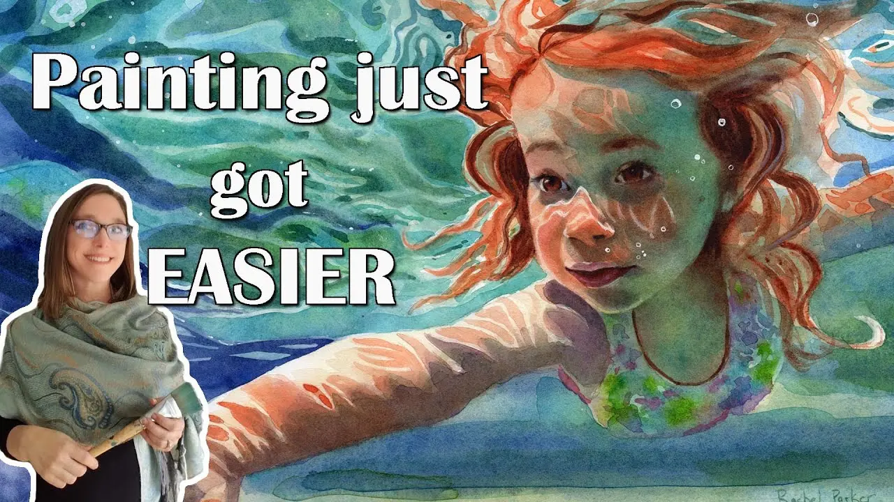
Table of contents
- How to mix complex skin tones
- How to paint water
- How to perfectly balance tonal values
- Limited palettes
- How to draw perfect outline with the grid method
- About ArtistAssistApp
Painting just got a lot easier! Have you ever put off an idea for a painting for a long time? Did you want to draw something, but the reference scared you? From today on, you will be able to paint from a reference of any complexity with the help of ArtistAssistApp.
In this video tutorial, a wonderful artist and art teacher, Rachel Parker Varner, introduces ArtistAssistApp, a web app helping artists with accurate color mixing, determining watercolor dilution ratios, perfectly balancing tonal values, simplifying complex reference photos, creating grids for accurate drawing proportions, and more.
ArtistAssistApp is useful for both beginners and experienced artists in various art mediums like watercolor, gouache, acrylic paint, oil paint, colored pencils, watercolor pencils, soft pastel, hard pastel, pastel pencils, oil pastel, acrylic markers, and acrylic gouache.
The video showcases ArtistAssistApp on both iPhone and Android devices. ArtistAssistApp acts like an app, but it's more like a website because you don't have to download it. With ArtistAssistApp, you don't have to download another app to clog up your phone. You can use it like a website on your phone, tablet, or laptop.
How to mix complex skin tones
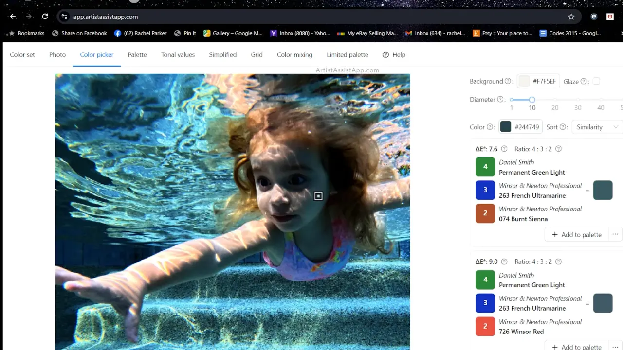
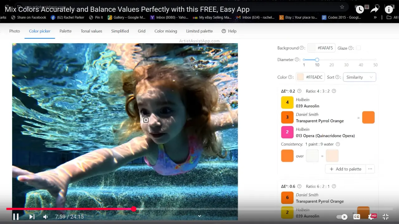
In the video, Rachel demonstrates the process of creating a beautiful painting of a girl swimming underwater from a reference photo with the help of ArtistAssistApp. The light coming through the water and reflecting off is making parts of her face glow blue and green. The color of the shadow cast on her skin underwater is also complex. How do you mix these colors? The ArtistAssistApp provides a variety of options for creating these odd-looking green shadows on the side of the face. Even better, the ArtistAssistApp provides guidance on the appropriate ratio for mixing these colors, ensuring you don't waste paint during the process. Mix four portions of Permanent Green Light, three portions of French Ultramarine, and two portions of Burnt Sienna. The mixture consists of four parts Permanent Green Light, three parts French Ultramarine, and two parts Winsor Red. The mixture consists of four parts Permanent Green Light, four parts French Ultramarine, and one part Transparent Pyrrol Orange. The second and third mixes are effective because the Burnt Sienna is too granular for painting shadows on the face. But ArtistAssistApp gives even more mixing options. You can try all these mixes in person to choose your favorite.
ArtistAssistApp even tells you what water concentration you need to mix with your watercolors. Do you need one part water to one part paint? Do you need three parts water to one part paint? The app will help you see how light the color is and how much water you need to add to your paint. It's a game-changer!
How to paint water
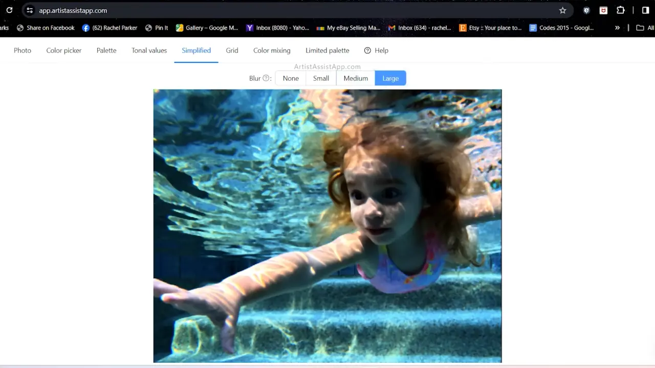
How can you paint so much water without practicing photorealism? If you like to paint more impressionistically, you need to simplify the reference photo. For example, in this photo, all the ripples in the water are very complicated. It's challenging for an artist to simplify the water while maintaining its recognizable quality. Once again, ArtistAssistApp solves this problem by doing the squinting for you. Some artists simplify their paintings by squinting at their pictures, which helps blur similarly colored or valued areas together to create simpler, larger shapes, a crucial aspect of loose and impressionistic painting. This app simplifies your reference photos. No more squinting. The app supports different blur strength settings.
How to perfectly balance tonal values
Balancing tonal values is as important as accurate color mixing. ArtistAssistApp helps you see the tonal values in your reference photo, so you can paint them more accurately. If you get your values right in your painting, you can use a lot of different colors, and it will still look realistic. ArtistAssistApp breaks down the values in your reference photo and shows you light values, medium values, and dark values. Painting light tones and preserving white areas is the foundation of the underpainting process. The regions left untouched or lightly washed represent the 'white of the paper, and it's very important to carefully paint around them. Using the app as a guide helps in identifying and delineating these crucial areas, facilitating a clearer understanding of where to focus attention.
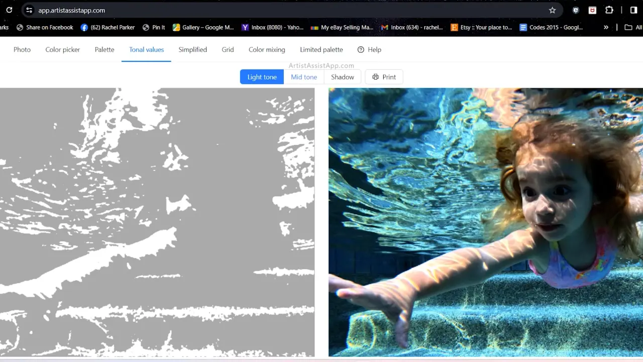
Next, paint medium tones in a sequential manner, followed by the darkest shadows.
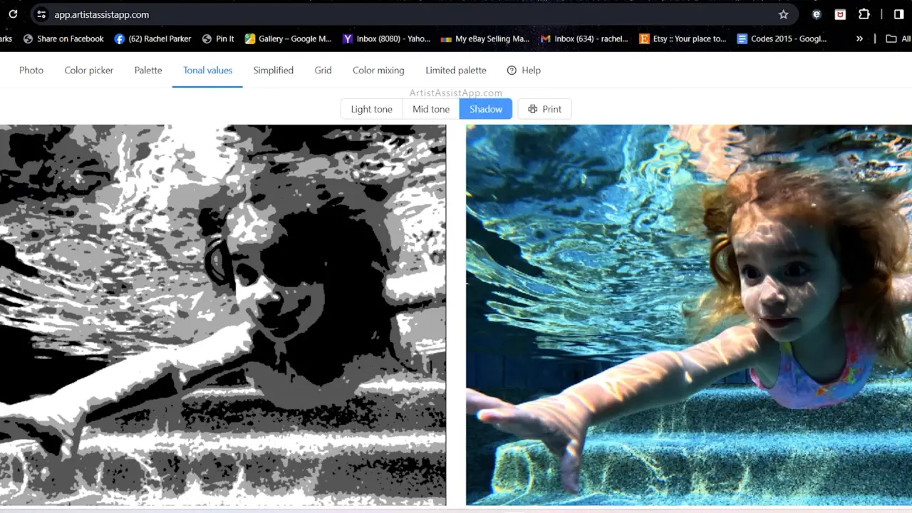
This systematic method is similar to a roadmap, streamlining the painting process and enabling artists to navigate through layers with precision. By utilizing the app's functionality to conduct a tonal study, the artist ultimately improves the overall painting experience.
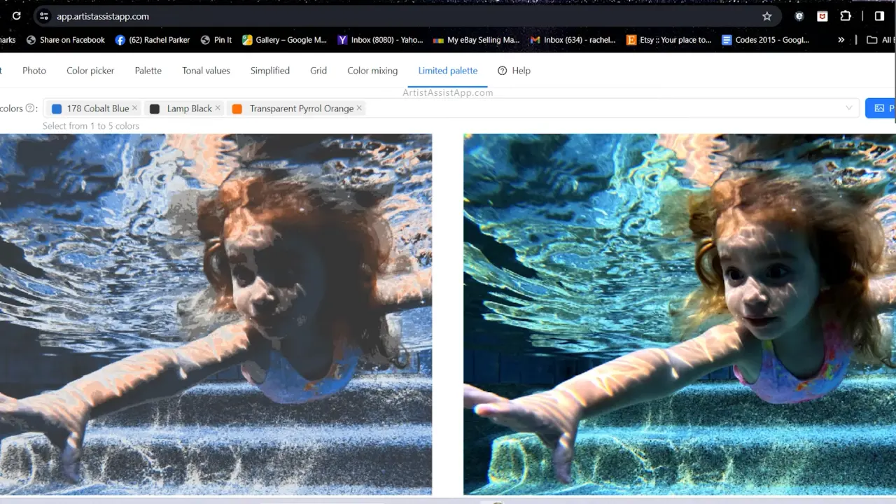
Limited palettes
With ArtistAssistApp, you can explore the concept of utilizing a limited palette in painting to enhance color cohesion and prevent overwhelming complexity. With ArtistAssistApp, you have the ability to select one to seven colors and see how your reference will appear when painted using only these colors. The app offers insights into simplifying complex color schemes and experimenting with different combinations.
How to draw perfect outline with the grid method
ArtistAssistApp offers grid functionality, which can be a game-changer for artists aiming for precision in their paintings. You can adjust the size of the grid squares according to your needs; for detailed paintings, opt for smaller squares, while larger squares work well for simpler compositions. If you've struggled with line drawing without software like Photoshop, this app has a solution. By overlaying a grid on your reference photo, you can accurately replicate proportions by drawing corresponding squares on your canvas.
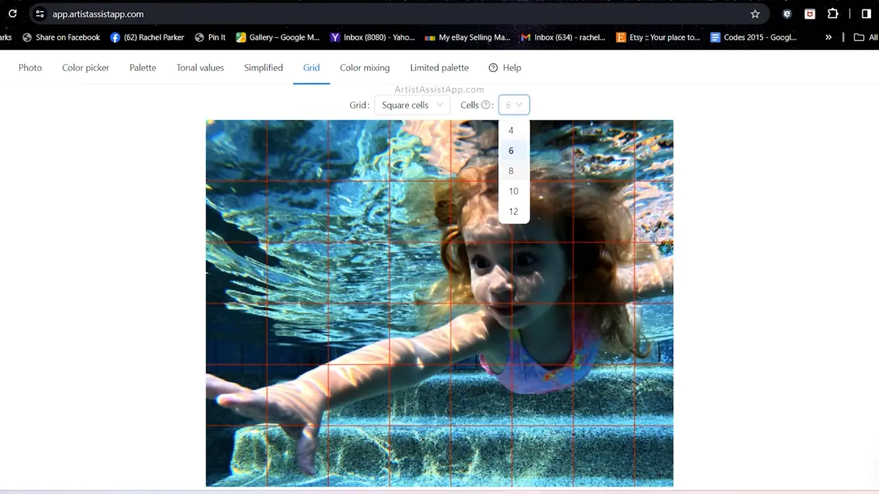
Starting with a grid on a separate sheet helps preserve your painting surface, allowing for adjustments without damage. While some may prefer freehand drawing, utilizing the grid system ensures better proportions and serves as a valuable tool, especially for those new to painting or seeking precision in their work. Integrating the grid system into your process can significantly enhance your painting experience and results.
About ArtistAssistApp
ArtistAssistApp, also known as Artist Assist App, is a web app for artists to accurately mix any color from a photo, analyze tonal values, turn a photo into an outline, draw with the grid method, paint with a limited palette, simplify a photo, remove the background from an image, compare photos pairwise, and more.
Try it now for free at https://app.artistassistapp.com to improve your painting and drawing skills and create stunning artworks.