Color temperature: warm and cool colors — a guide for artists
Table of contents
- Warm vs cool colors: the basics
- The psychological basics of color temperature
- Understanding color bias
- Practical application in color mixing
- Using color temperature to create depth
- Color temperature in ArtistAssistApp
- About ArtistAssistApp
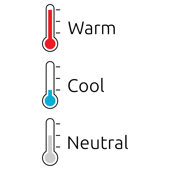
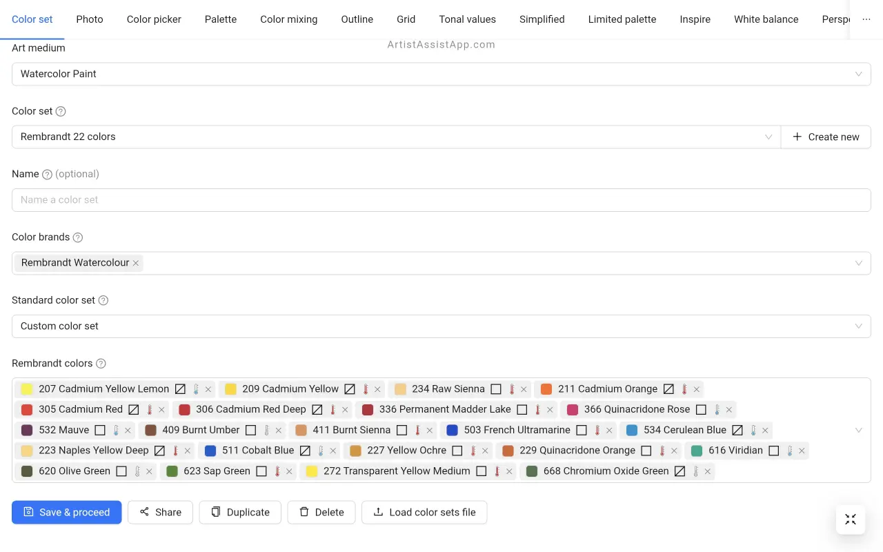
ArtistAssistApp algorithmically estimates the color temperature, whether it is warm, cool, or neutral, and shows the corresponding symbol next to the color name. You can choose a color mixing recipe based on color temperature, or create your own color set by selecting colors with the desired temperature.
Warm vs cool colors: the basics
Traditional color theory distinguishes colors by "color temperature": warm colors and cool colors. The color wheel (primary, secondary, and intermediate colors) is split into two halves: warm and cool. The warm colors include: yellow, orange, and red. The cool colors include: blue, magenta, and violet.
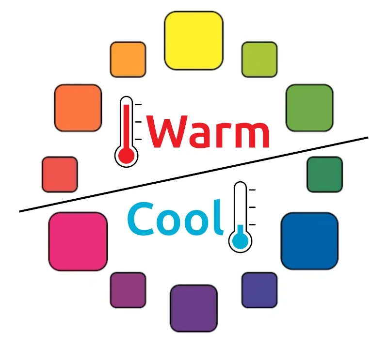
Some colors, such as black, white, and pure gray, are considered neutral because they are neither warm nor cool.
The psychological basics of color temperature
This definition of warm and cool colors is purely psychological. We strongly associate red, yellow, and orange with sources of heat, such as fire and the sun. Blue is the color of water, ice, and the vast, open sky. Blue-green is the color of shade under trees.
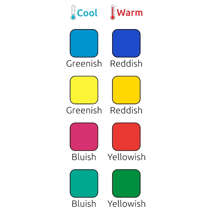
Understanding color bias
It's easy to see that yellow is warm and blue is cool when you compare them. It may be less obvious when comparing red to magenta, as they are adjacent on the color wheel. However, if you compare their color temperatures, you'll see that a bluish red (magenta) is cooler than a yellowish red. Describing how a color leans toward another primary or secondary color is also referred to as its bias.
- Red and green can have a yellow or blue bias.
- Yellow and blue can have a red or green bias.
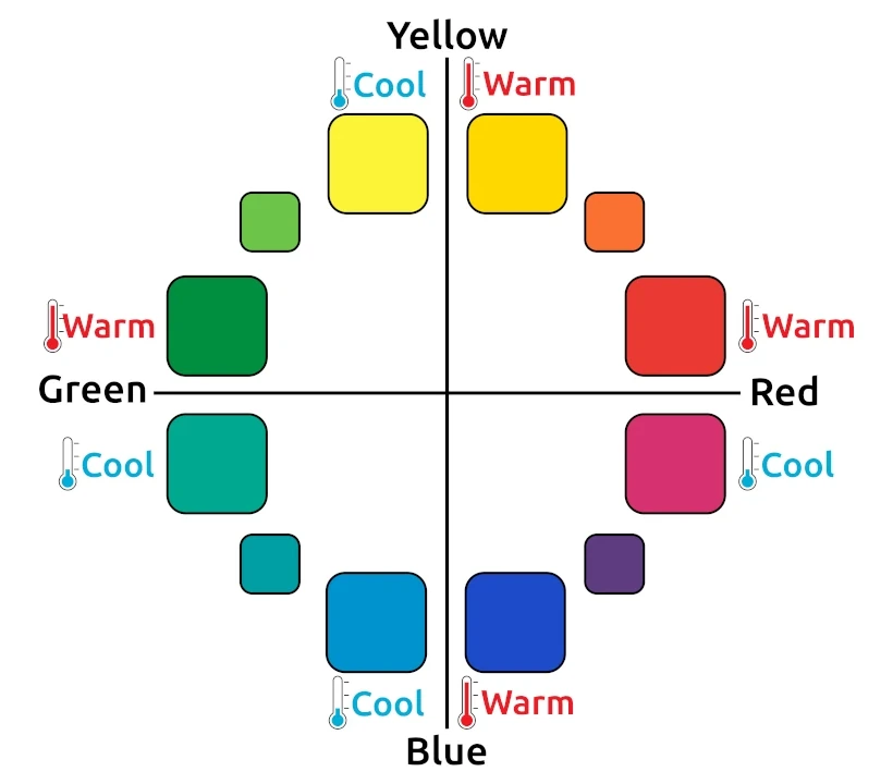
- Yellowish-red is warm; bluish-red is cool.
- Reddish-blue is warm; greenish-blue is cool.
- Reddish-yellow is warm; greenish-yellow is cool.
- Yellowish-green is warm; bluish-green is cool.
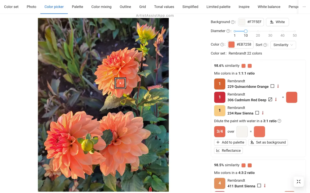
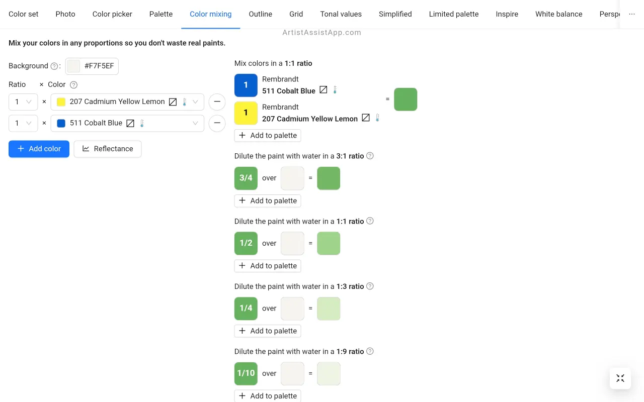
Practical application in color mixing
The base of the six-color mixing system is two colors, one warm and one cool, for each of the three primary colors. This allows for the mixing of highly saturated secondary colors.
Learn more about traditional color theory and the six-color mixing system in this tutorial.
Using color temperature to create depth
The most powerful use of color temperature is to create depth, atmosphere, and perspective. With this simple rule — warm colors advance and cool colors recede — you can create a convincing illusion of deep space on a flat canvas.
- As the distance from a color increases, the color temperature falls and the color becomes cooler.
- A dark color becomes increasingly light as the distance from the color increases.
- The saturation of a color decreases as the distance from the color increases.
When painting a landscape, use your warmest, most saturated colors in the foreground, such as a bright red flower or a warm green leaf. As objects get farther away, systematically make their colors cooler and lighter by adding more blue and gray.
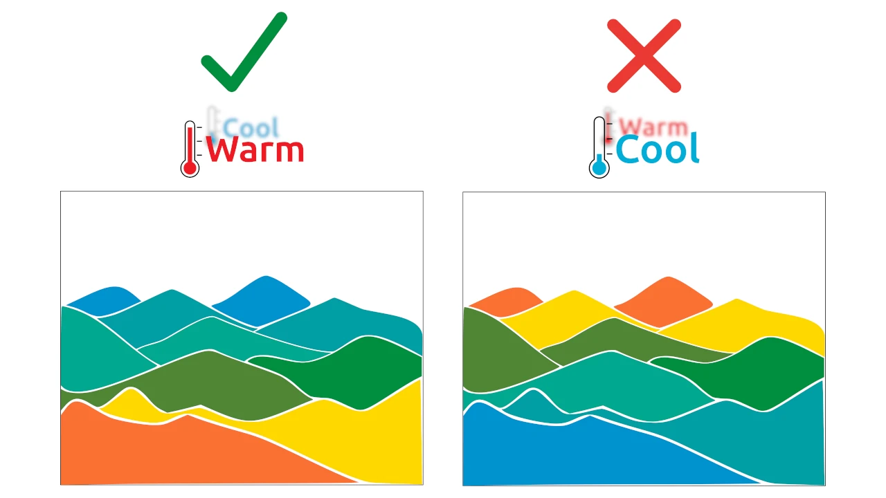
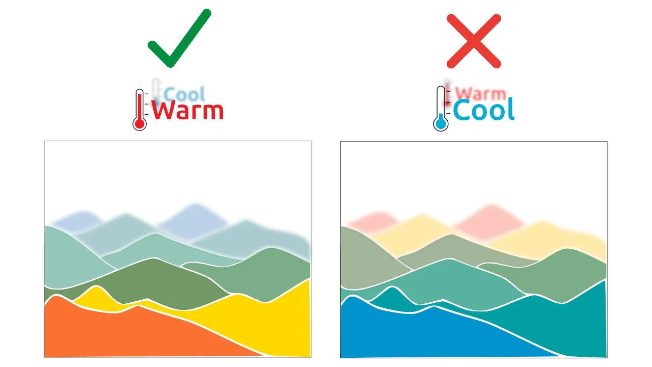
This mimics a real-world phenomenon. When you look at distant mountains, the thick layer of atmosphere between you and them scatters light, making the mountains appear blue and gray and less distinct.
Color temperature in ArtistAssistApp
ArtistAssistApp algorithmically estimates the color temperature, whether it is warm, cool, or neutral, and shows the corresponding symbol next to the color name. You can choose a color mixing recipe based on color temperature, or create your own color set by selecting colors with the desired temperature. However, it's an estimation, so artistic perception may vary for some colors.
About ArtistAssistApp
ArtistAssistApp, also known as Artist Assist App, is a web app for artists to accurately mix any color from a photo, analyze tonal values, turn a photo into an outline, draw with the grid method, paint with a limited palette, simplify a photo, remove the background from an image, compare photos pairwise, and more.
Try it now for free at https://app.artistassistapp.com to improve your painting and drawing skills and create stunning artworks.